Gloo
Deliverables
- UX/UI
- Shippable code
Tools used
- Mobbin
- Claude
- Figma
- Photoshop
Unify Gloo’s Product Auth Experiences
We had a fractured login and sign up experience. Each of our apps had authentication experiences that looked different from each other—different teams, and sometimes different databases. Another challenge? Because it was a hosted UI, we were working within someone else’s sandbox. Our animated, responsive, and modular design had to be rebuilt without any client-side scripting—the hosted environment sanitized out script and JS-based interactions, so the animation had to be recreated using CSS-only techniques (transitions and keyframes) instead of the JavaScript it was originally built with.
What started as a personal initiative grew into something I got the backing of product owners and the engineering team for in developing a new experience. I put together a small design group to audit ourselves and iterated against those findings.
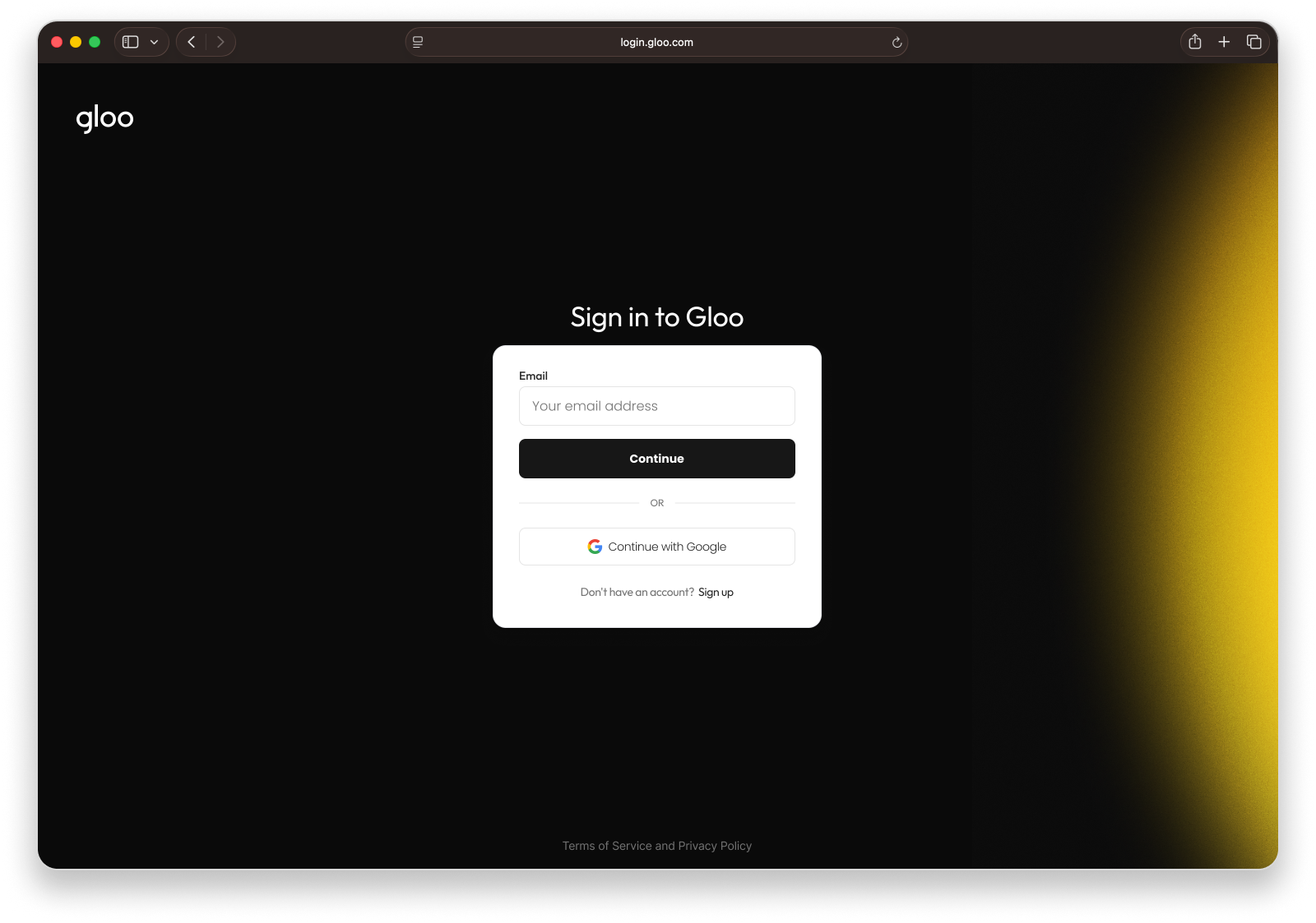
Our zero state
Our canvas was essentially blank—for brand alignment we had border radii, border colors, and headline fonts.
Obvious drawbacks are looks and lost cross-selling opportunities. Ideally all of our platform products would have a presence here: 1) so that users could verify what product they are logging into and 2) what other offerings we had available.
The bar was low, but the expectations were high.
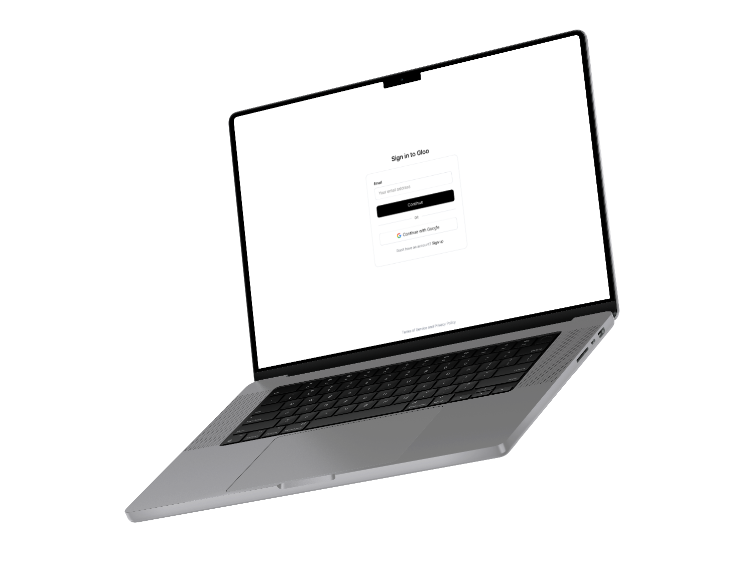
Our zero state
Our canvas was essentially blank—for brand alignment we had border radii, border colors, and headline fonts.
Obvious drawbacks are looks and lost cross-selling opportunities. Ideally all of our platform products would have a presence here: 1) so that users could verify what product they are logging into and 2) what other offerings we had available.
The bar was low, but the expectations were high.
Assess the Landscape
There are some really elegant authentication experiences out there, so how could we level up within our constraints? How could we differentiate with some innovative elements? Could we use motion to help make it feel less stale as a frequently visited page?
Assess the landscape
There are some really elegant authentication experiences out there, so how could we level up within our constraints? How could we differentiate with some innovative elements? Could we use motion to help make it feel less stale as a frequently visited page?
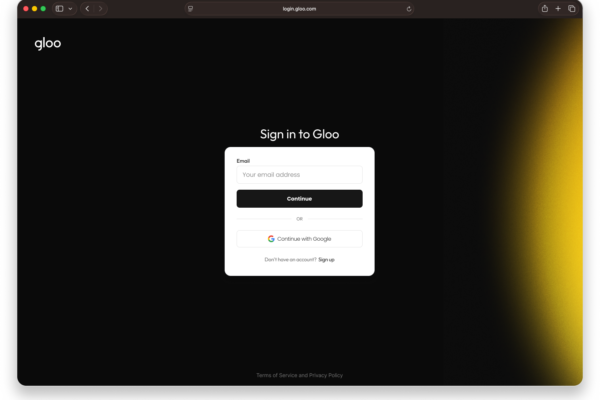
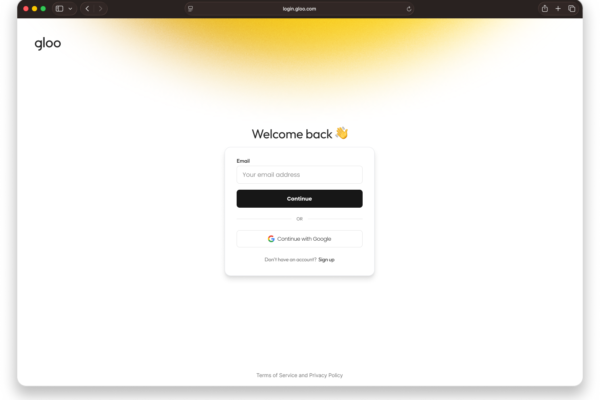
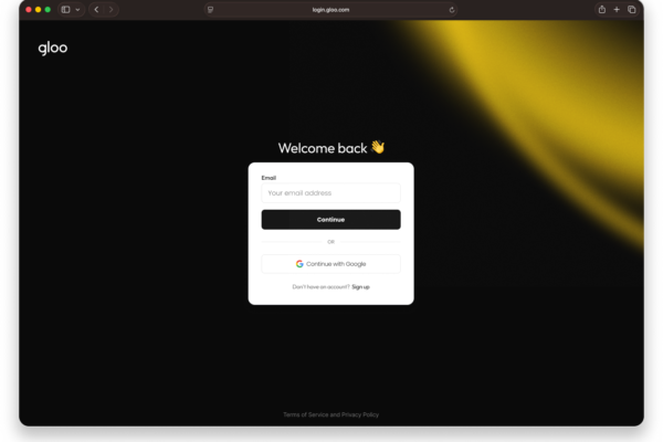
Light touch (the glow up)
I had some great creative momentum coming out of the discovery phase, but was pulled back by “what’s the lightest touch you can do in the quickest time?” Hmm, give me 5 minutes…
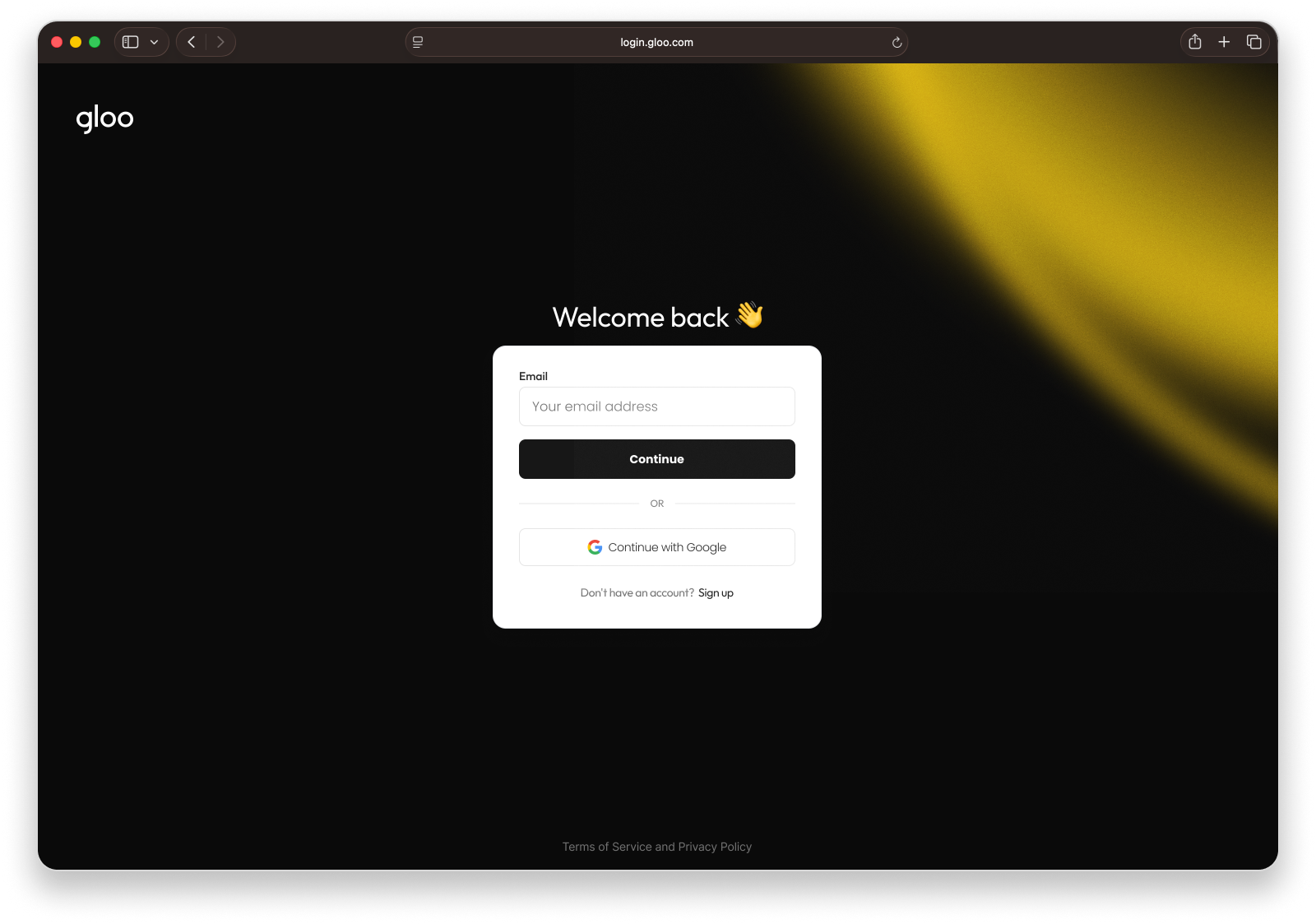
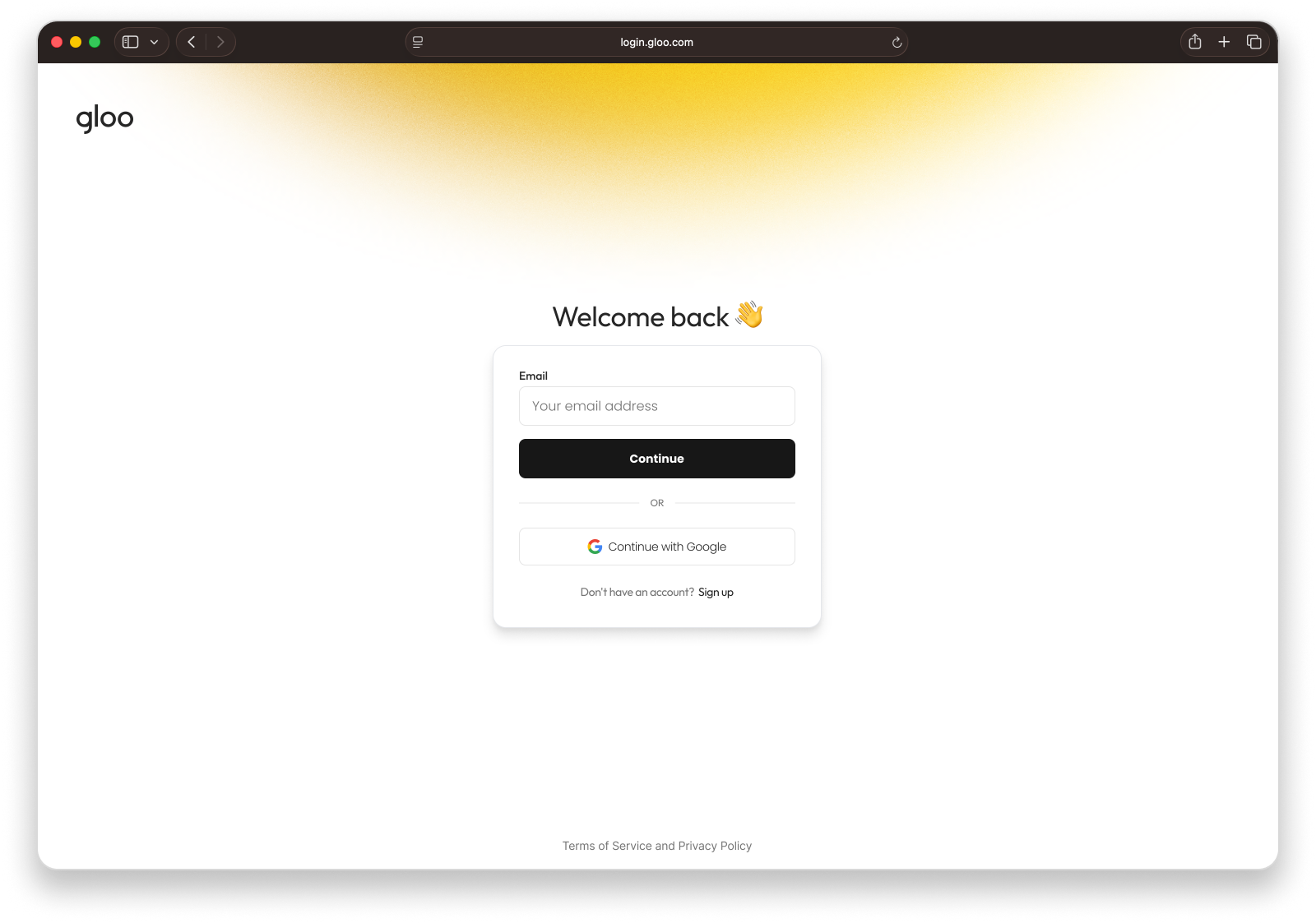
Light touch (the glow up)
I had some great creative momentum coming out of the discovery phase, but was pulled back by “what’s the lightest touch you can do in the quickest time?” Hmm, give me 5 minutes…
Now, make the logo bigger
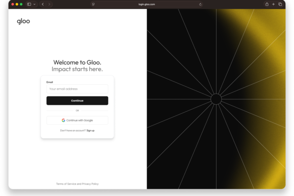
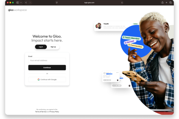
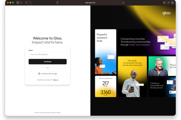
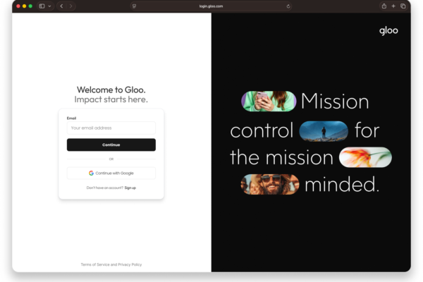
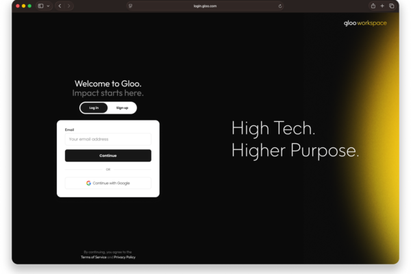
The light touch didn’t solve any of our initial problems of user context and multi-product adoption. Stakeholders now understood the depth we’d need to go, so I hit every opportunity our brand had to offer—imagery, typography, colors, patterns, marketing assets.
Have you tried making the logo bigger?
Yes, Craig, I’ve tried making the logo bigger 😉
We’re headed in the right direction, but the glow isn’t doing us any favors and we’ve had to pivot to light mode as our default view.
At this point, I also ran a rose, bud, thorn evaluation exercise with our design team to see where there were opportunities and which ideas didn’t have legs. Now, it was time to iterate against those findings.
Have you tried making the logo bigger?
Yes, Craig, I’ve tried making the logo bigger 😉
We’re headed in the right direction, but the glow isn’t doing us any favors and we’ve had to pivot to light mode as our default view.
At this point, I also ran a rose, bud, thorn evaluation exercise with our design team to see where there were opportunities and which ideas didn’t have legs. Now, it was time to iterate against those findings.
We arrived
After numerous iterations, considerations, and chipping away at some nuggets we unearthed in one of the earlier rounds, we have an option that works for all of our product teams, unifies our platform, and provides opportunities for multi-product adoption.
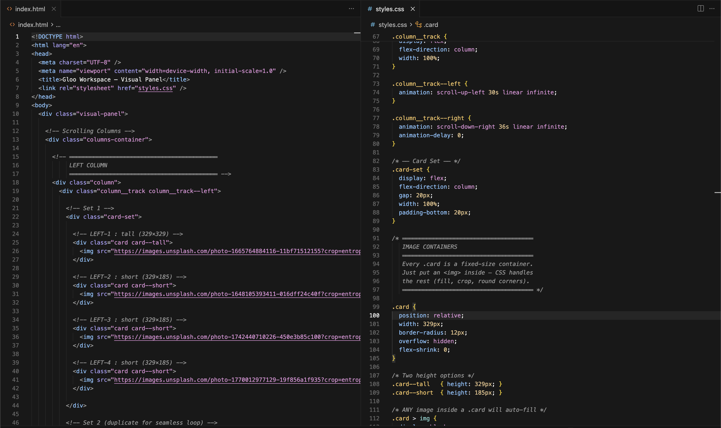
Using the powers of Claude Code, I handed off the Figma files. This product needed to be built without JS, json, or scripting of any kind but also needed to be coded in a way that auto cropped images and provided a foolproof way for a non-designer, non-engineer to be able to update the page as our product suite grew [i.e. heavily notate the code so that it’s difficult to mess up].
✅ users know they are logging into a Gloo product
✅ is this evergreen, modular, easy for brand team to update?
✅ are all Gloo products represented
We arrived
After numerous iterations, considerations, and chipping away at some nuggets we unearthed in one of the earlier rounds, we have an option that works for all of our product teams, unifies our platform, and provides opportunities for multi-product adoption.
Using the powers of Claude Code, I handed off the Figma files. This product needed to be built without JS, json, or scripting of any kind but also needed to be coded in a way that auto cropped images and provided a foolproof way for a non-designer, non-engineer to be able to update the page as our product suite grew [i.e. heavily notate the code so that it’s difficult to mess up].
✅ users know they are logging into a Gloo product
✅ is this evergreen, modular, easy for brand team to update?
✅ are all Gloo products represented