Salad.io
Client
Salad.io
Deliverables
Tools
Sketch
Zeplin
Photoshop
Role
Contract Product Designer
Platform
Windows
Project Overview
Mining the future
A creative director friend connected me with Salad, a distributed cloud computing platform. It lets individuals rent out their idle computer power in exchange for rewards, and gives businesses affordable access to that same power for work like artificial intelligence. The team was fully remote, spread from Australia to Switzerland. I joined as a contract product designer, taking direction from and working closely with their Head of Design.
This was a dream client. Their edge cases were documented before design even started, and their explicit wireframes gave me a clear foundation to build on. In about a week and a half, those wireframes became polished screens that were handed off through Zeplin, implemented, and launched.
The Challenge
A lot of content, and a gamer audience
The interface was designed for Windows but roadmapped for web and mobile, so it had to be scalable and modular from the start. Our audience was gamers, so the look needed to feel like home to people who already live in that world.
The app also had to surface a lot of copy and content, and users needed to understand how Salad works without feeling overloaded. The wireframes solved the structure, but they relied on many boxes within boxes. Left as they were, that would have added to the cognitive load.
- Windows-first app, roadmapped for web and mobile
- Systemized, modular components that scale as features are added
- Layouts that flex between viewports and devices
- A visual language that feels native to gamers
- A large amount of content, balanced against user education
- A fully remote team, with wireframes as the shared source of truth




My Solution
From wireframes to polished screens
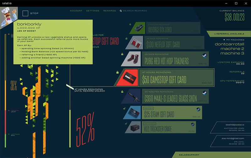
I made two contributions that I’m proudest of. The first was the type treatment across the app: cards, modals, dialogues, and popouts. With so much content to surface, a clear type hierarchy was what made the experience approachable while still educating users.
The second was reducing the boxiness. I used brand colors and surfaces to replace nested boxes, which lowered the visual noise and pulled attention toward the primary calls to action.
The vegetable project loader on the left was the most fun part. It shows users how close a mining project is to completion, and it ties back to the Salad name.
The tooltips below explain some of the more nuanced decisions made 👇
Explore More
Explore More
Explore More
Explore More
Unified Authentication